Powered by Blogger.
Showing posts with label shutters. Show all posts

The Redo of the Family Room Wall

Sunday, March 11, 2012

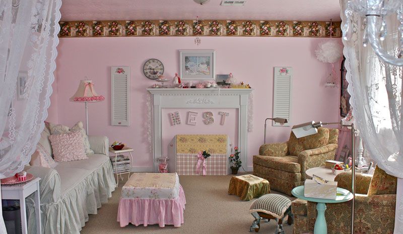
Okay, I promised you the results of the redecorating of this wall. I think I'll put a new "something" on the left side. Plus you get the view of what we see when we look in from our dining area with the lace curtains framing the family room.

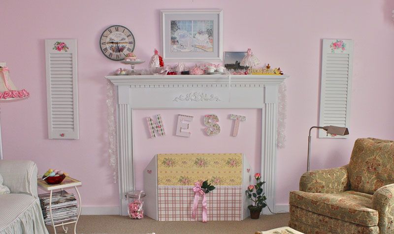
Yep, I'll put something on the left bottom. Maybe some pretty storage boxes that are in abundance around here. And something on the right wall just above the mantel. I'm a symmetrical chick, maybe not totally, absolutely symmetrical but balanced better than this. I'm OCD about symmetry.

These chairs are 25 years old and don't especially go with the decor of this room but I've had them recovered 3 times with the last recovering about 6 or 8 years ago with this kilim-looking fabric and loved it. If I suggested recovering them now, Love Bunny would have a fit. Besides, they're gorgeous in person and still look almost new. They are Baker chairs and I paid about $800 each 25 years ago. So they're well made and last a long time. Plus I'm on a frugal kick and don't want to spend.

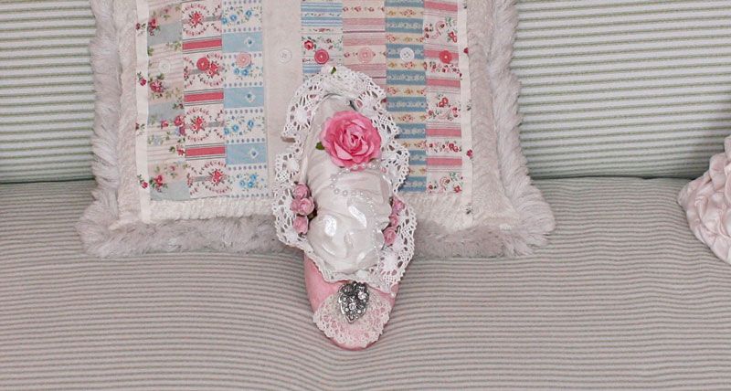
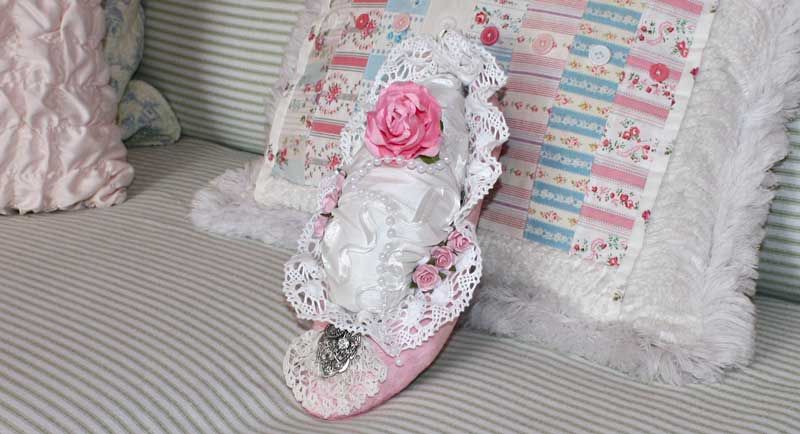
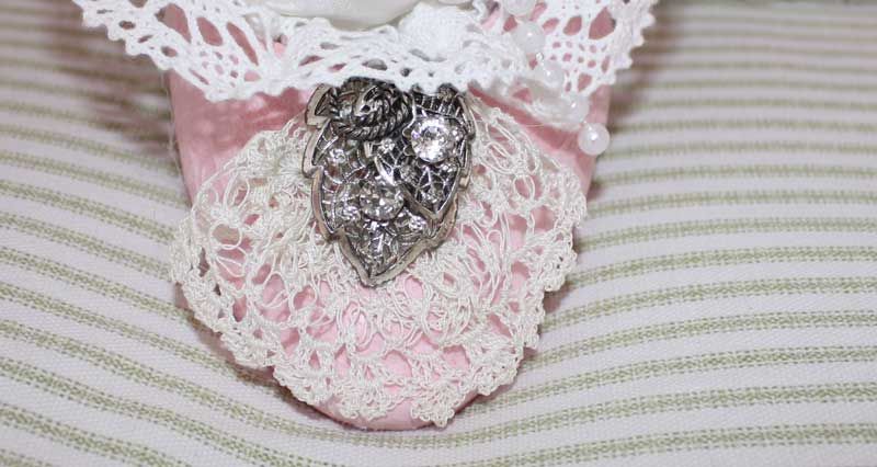
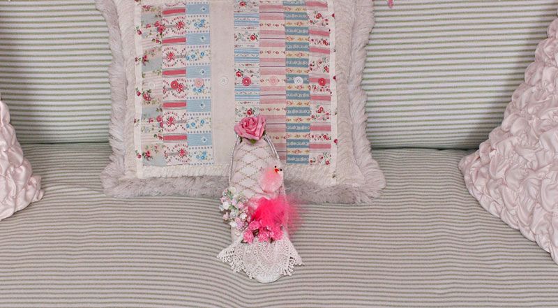
The tale of these shoes is: I couldn't part with them. I loved these shoes and bought them about 28 years ago at Macy's. I wore them out on the bottom but just couldn't throw them out so I made little princess shoes out of them by painting them, adding some froufrou stuff to them and using them as decorative items in this room. I know. I'm pathetic. But what can I say? I'll never love a shoe like I loved these simple red, plain 1" heel shoes.

And did you bloggers know that blogging is the test site for my photographing things around the house? I play at photography. I am definitely NOT a pro at this but I love doing it to experiment with my Canon Rebel XS. Love this camera!

See how my macros turn out? Great little camera for $500.


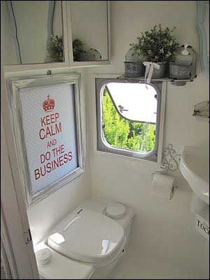
You all know how I absolutely hate camping. Love Bunny even bought a pop-up camper so I would go with him and be happy about it. I still hate it. I love suburbia and Applebee's, Olive Garden and Outback. I'm not a woodsy-type person. I love being home in my bed with my pillow. I love plugging my hair dryer and curling iron into a socket. I love eating indoors instead of fighting the horseflies. I hate the sound of four wheelers all night long. I hate the thought of being eaten by a bear. I hate having to go to the bathroom by a tree out in the woods; it throws off my digestive system. I hate not being able to craft, surf the internet and having to read by propane lantern at night. I. Hate. Camping. It's that simple.

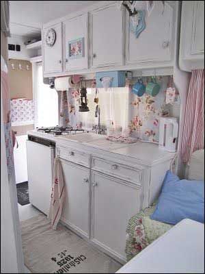
However, if hubs could accommodate me with one of these slick little cuties, I just may change my mind a fraction and venture into the wilds of Idaho with not much groaning and moaning. Maybe.

This is definitely stylin'! And who would have thought the horns of an animal could be made to look shabby chic?


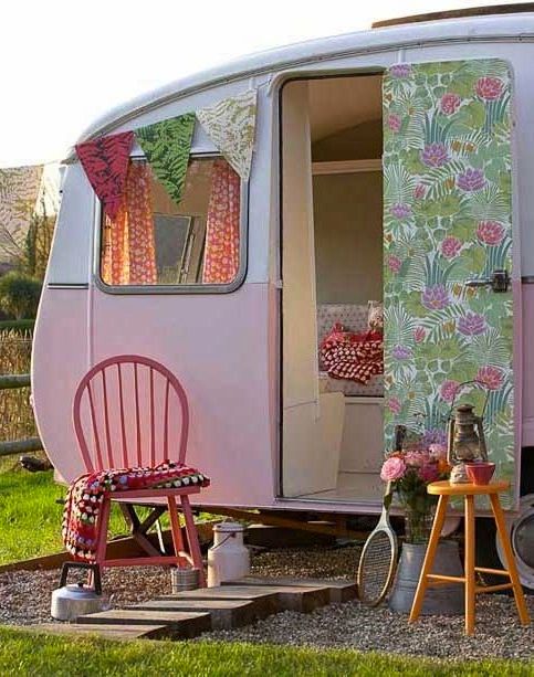
This looks like it could just possibly have my name on it also.

This could also fill th' bill for me.

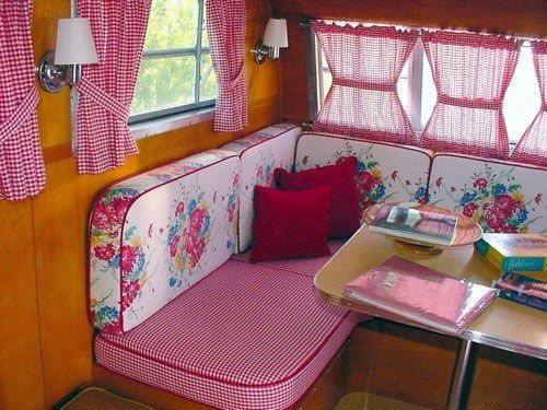
This is darling also. The jealousy windows are a plus for me. Isn't this adorable?

And I'd definitely want it painted these colors.

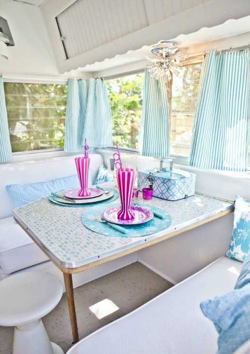
I'd want this in the woods with me also... If I ever want to go camping, that is.

Tact is the ability to describe others as they see themselves.
~*~

The Pink Painted House

Wednesday, December 17, 2008

My greatest treasure is hubby. He gives me license to do as I darn well please. Whatever I want to do is just fine with him 99.9% of the time. Well, there is the occasional "I wish you wouldn't do that", but they are very few and very far between. When I said I wanted to paint the house pink, fine with him. So these are the first photos of the living room, kitchen and dining area for you to see.

I feel like I'm living in a confectionery store now. I absolutely love and adore it! How can a simple color make such a difference in a room and in a mood? Yesssss, it truly does. It just lifts my spirits up. As most of you know who've seen this blog before, I recently did my office/painting room and my sewing/craft room in a vibrant pink. This time for the main areas of the house I went a shade lighter. I did it this way.

A trip to Home Depot and looking at their samples got me thinking about a paler pink than the other two rooms simply because if I changed any furnishings in the living room it might be a tad hard to "coordinate" things with the wall color if it was too bright pink. So I picked a color I love, Behr's candy tuft, and had them make me up a quart with 1/2 the colorant in it. When I came home and painted it on several walls to test it, it seemed more lavender because the only colorant in it was magenta. Magenta has blueish tones to it. So I picked another color, Behr's cupid arrow. It had different colorants in it and after getting them to put in 1/2 the colorant again, that color seemed perfect after I came home and painted patches on different walls again and lived with it for a couple of days. The paint stores will do anything you want. You don't have to accept just their "colors." Then I bought 5 gallons to start the painting. It was definitely pink but not "in your face" pink, which I really like anyway, but wanted something softer in the main rooms and hallways.

Then there is the concern of getting the "pink" to show properly on different monitors. These past 3 weeks I've been on my laptop and notice huge differences between it and the desktop and huge monitor in my office. So I tried to pick settings that show it accurately. Impossible, chicks!! The closet I can describe it is "a tad more than light pink but definitely pink." I'm loving it.

I also decided that I had put too much stuff on the old beige-y walls to try and obliterate the color with the frou-frou, so this time I "scaled" down a bit - scaled down is a relative term here. I "reassigned" things to different places! ;-) Case in point - the living room. I brought the shutters I painted white from the dining area into the plant shelf in the living room. I like it much better here than in the dining area.

Notice the uncluttered look in that area now. Something here, just less "fluff" and the pink shows quite well. I brought in a picture that my brother and his wife gave me from the living room and put it on the right side of that entry.


I also brought the leather chair from the family room into the living room. It looks much better in there than in the shabby chic style family room. I prefer my living room a tad more formal than the family room.

The archway separating the living room and the dining area is only about 4" wide and being from California, I don't want anything up there that can kill me if it falls so I've had these little blocks of wood that I put little roses decals on and put the up there for a little bit of pizzazz.

Yesssssssss, the train limited edition prints still went up there to satisfy hubs but I put the pink suitcases back up there to "feminize" it a bit and only one suitcase did I leave in its original vintage state. But by the white door is probably the most accurate of the color of the walls I could get on THIS monitor. Yours will appear differently probably. That hallway on the left is still the beige-y color. The painter's wife went into labor and he had to leave! I'm soooo excited for them, but not sure when he'll be back to finish the hallways. You can see he prepped by putting up tape and can definitely see the color difference from the walls in the room to the wall on the other side of that archway.

Another view of the dining side of the archway and the wall to the right of that plant on the living room side is the wall in the hallway that still has the original color on it. See how much brighter and cleaner it looks. Squeeeeeeeeeal. I love it, chicks!!!
To be continued.................

Photographers and Stylists

Wednesday, August 20, 2008

When I read a magazine or book, I read all the little, seemingly inconsequential, things in it - who did the photographs, styling, editors, staff, date it was published (if a book) and all those little things with which we don't concern ourselves very often. I can actually tell when the editor of a magazine has changed just by perusing the magazine even before I sit down to peruse it leisurely. They each have a certain "style" as evidenced by the "recent" (few years ago now) changes in Romantic Homes magazine. I noticed it immediately with Country Home and Country Living through the years.

But besides seeing who the writer of the article is, and let's just talk about magazines in this post, I look for the stylist also.

I didn't think it would be a particularly hard job, but certainly glamorous, and would have loved to do it. But since I've become a photographer, and I use this term very loosely here, I learned how hard both jobs can be! Getting the light just right. Cramming all the lovely items into a small space to add pizzazz to the photo. Hard work I'm sure!! I don't even come close to being good at either. I am barely adequate when posting pix for this blog. So with great "reverence" I salute the photographers and stylists of those truly beautiful stories we read in the magazines today.

Now, the the proofreader I've noticed is slacking on the job though. The current issue of Romantic Country, summer 2008. Have you noticed that on page 21 in the top left picture the clock is running backwards? And just below that one the clock looks like it's upside down. Now, that can't be a reversal of the photo but what's with those people hanging the clock upside down???? Page 28 left photo of the buddhas. Read the description and look at the buddhas. They've reversed the photo. Then we have page 50! Whooooa chicks! The pink telephone dial is backwards, the writing on the shadow box on the wall is reversed and the clock again is running backwards. I know, I know, not a big deal, but those proofreaders should have caught those "goofs"! Yoohoo, Romantic Country, I'm available!!!!! I'm not cheap though!! :-)
~*~

The shutters were put beside the archway on the dining room side. I'll probably spend the rest of the year patching nail holes........uhhhhh, only the visible ones though!

I've put one french wire basket under the picture off center. I could not get it centered with all the other stuff. AND since I worked so hard to get it out of my daughter's shed and home to Idaho I'll be darned if I'm NOT going to put it up somewhere! Now I just have to figure out where the other one will go. It will have to be low because of not being able to see what is in it up high. I also hang items HIGH and low on walls. I think it adds visual interest and love it. I've even put pictures leaning on the wall on the floor or on baseboards too.

Be creative in what you do in life and how you decorate your home. It sets you apart from all the "cookie cutter" or "accepted" decorating styles and shows YOUR style, not your friend's style or the show room salesperson's style, but your unique style! I do and I highly recommend it. :-)

Today I went to Boise since Love Bunny is away. I bought these 2 feather pillows for $24.99! Squeeeeeal, yes for both! That's $12.50 each for a 20" x 20" feather pillow. I am truly blessed. :-)

Now for this next part you're going to have to use your imagination since I didn't get "before" pictures but they're in some picture somewhere on this computer but I'm too lazy to find it so I'll just describe the "before" to the best of my ability. Ooooohmygosh!!!! Yep, that's what it was before. (I bought it but for the life of me I can't remember WHY I would have bought it!!) An "ohmygosh" lamp! Dark wood with a beige shade and amber crystals hanging down. Pretty ugly let me tell ya, chicks! Soooooo, I decided to take my handy dandy spray can of white paint and spritzzzz it. I had that other shade - remember, I stuck a faux fern in it till I could figure out what I was going to do with it?? Okay, after taking off the amber (yuck!) crystals and painting the lamp white, I then decorated the lamp shade.

Now, a sweet friend named Sharon gave me a little charm last year and I wanted to do something reeeealllly special with it since it is so teensy tiny. I don't see how she paints on them. Very tiny! I decided to put that little pink roses charm on the new lamp. VoilĂ , the new frou frou lamp with parchment roses, lace and Sharon's lovely exquisite charm!! Very little effort for spectacular results!!!


Sharon's hubby is really into western movies. He watches them frequently. I have this art print by Chuck Haan in my hallway. No, I am not into western art, but when I saw this many years ago in a little antique shop in the Niles area of Fremont, Calif. it touched my heart. It's an Indian brave looking sweetly at a little bluebird on a snow covered branch of a tree in the dead of winter. It just stole my heart away and I had to have it. So even in a romantic, shabby, girly pink house this print holds a place of honor. I thought Sharon might like to show it to hubby.

The point of this story is: If you love it, if it touches your heart, then you should have it no matter what the decor of your home is. Ooooooh, and btw, please don't tell Love Bunny I said this. It DOES NOT apply to model trains!!! No no no no no no no no no!!
 

Popular Posts