Powered by Blogger.

Caroline Walking

Monday, July 18, 2011

Being her great grandmother I laughed myself silly over this video of course, but I do think it's funny especially at the end. I've watched it at least 15 times since Mandy sent it to us. Mandy says she does fine but when she carries something she's top-heavy and topples over. :-)


~*~

Where Bloggers Create 2011

Thursday, July 14, 2011

I've come a bit late to the party since I just today heard about it. Anyway, just click above on "My Romantic Office and Studio" and it will take you to where I work and create.~*~

Just More Rooms to Drool Over

Monday, July 11, 2011

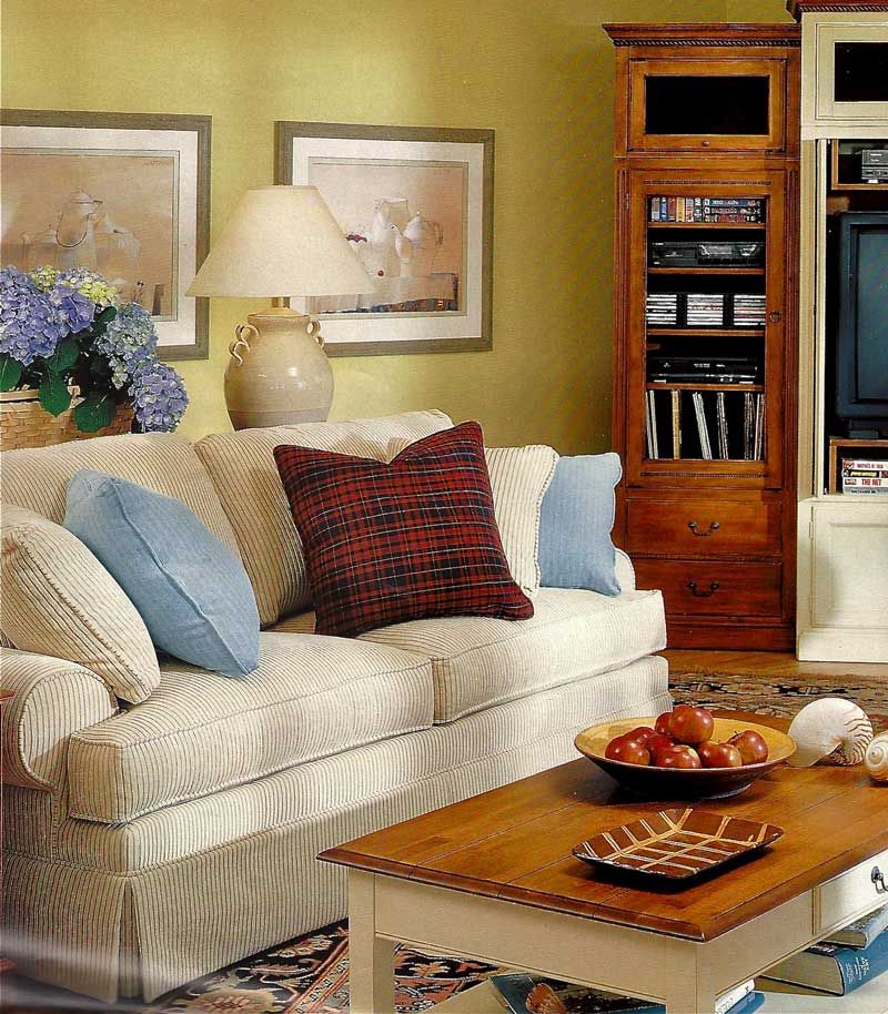
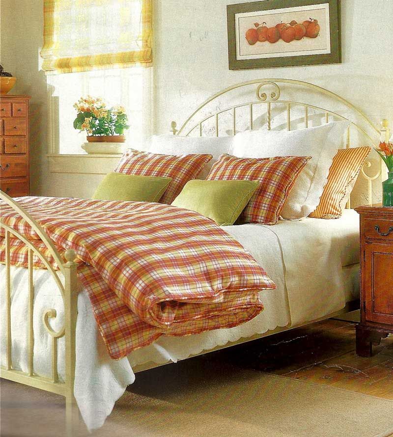
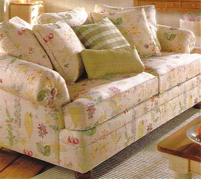
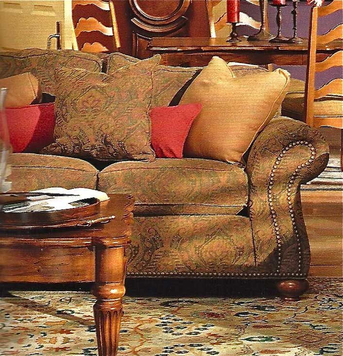
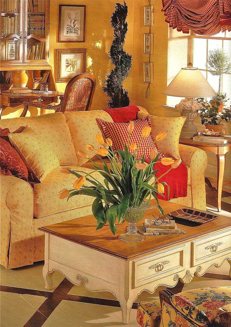
I'm struggling to keep my blog somewhat updated while doing this mission. I thought it would be a breeze, but I was wrong. It is most challenging. I'm online making phone calls, keeping notes and updating ONLINE what I'm doing. So I just wanted you to see these lovely rooms I saw in an Ethan Allen magazine some years ago.


Red/pink and yellow are my favorite color combinations as I've said before. This is a particularly stunning shade of yellow and I love it. I also prefer 2 cushion sofas as it gives the person sitting on it more room, plus, rarely do 3 people sit on a 3 cushioned sofa. At least, that has been my experience.


I absolute LOVE this sofa.

Another room decorated in my favorite color combo.
~*~

Extremely Unique Architecture Design of Upside Down Home Idea

Wednesday, July 6, 2011

Unique Architecture Design Upside Down Home
Have you ever seen the house upside down? When you come to a region that has recently occurred earthquake, then you will easily find it. And in a state badly damaged, of course. But it would be different if you came to visit Szymbark, a small village in Poland. There was a famous house, visited by many people because it has extremely unique architecture design. The uniqueness of this famous design, because it was built upside down. This upside down house project was designed by Daniel Czapiewski, a Polish bussinesman and philanthropist.


Requires 114 days to build this house, much longer than build a normal house that is usually completed within three weeks. That is because the workers are confused, disoriented, in understanding the idea of ​​building the upside down home. The walls are generally built straight, it must be built with a slash. So is the case with certain parts that belong in the top, turn under. Not only the workers who like to be disoriented, even if you do not see these images, might have trouble understanding the upside down home design presented in this article.

From the overall picture in this article, you can see that all parts of the house was built upside down. In fact, to reinforce the impression, the upper house looks like a building foundation. In our imagination, can probably imagine there is a giant coming, then unplug the house and its foundation from the ground. But then the giant made ​​a mistake by putting the house upside down. Of course, this is just an ordinary joke, because it is in fact a unique architecture design of the upside down home really exist in Poland. If there is spare time, could become one of the objects to be visited. And don't forget, take pictures in front of the house as proof that you really have to visit it. [via]
Unique Architecture Design Idea
Extremely Unique Architecture Design Upside Down Home
Unique Home Architecture Design_3

Modern Architecture Design Applied to Vodafone Headquarters Building by Barbosa & Guimaraes

Vodafone's Modern Architecture Design
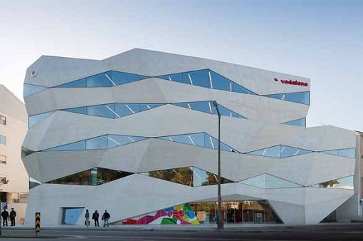
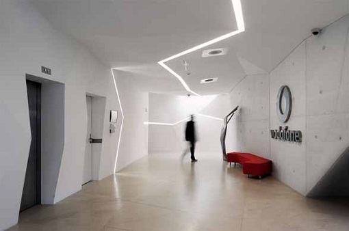
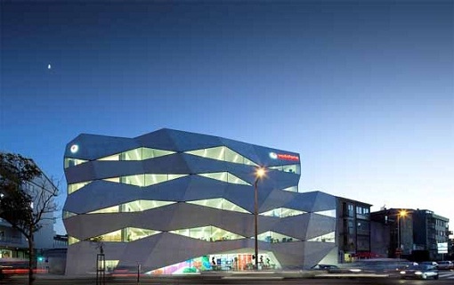
Vodafone has a new building as their headquarters, located in Porto Portugal. The building design uses a modern architecture, designed by Barbosa & Guimaraes. Building that serves as the new headquarters, has a slogan Vodafone "Vodafone Life, Life in Motion". When we look more carefully, the first image above, the building has an irregular shape, with many facets as a display face. Maybe we will be stunned while thinking: "How is it possible to make structural design like that?" Concrete structure be the answer to your question. Yes, this building is dominated by the performance of the functions of concrete structural and exterior. In many building designs, we know, more concrete functioned to support the structure. But in this Vodafone headquarters building design, concrete plasticity optimized to obtain a design that is truly unique and unusual. One thing we can learn here, that the concrete can carry out multiple functions properly, structure and exterior function.

When peeled from the technical point of view, this building has a high complexity. With an unusual concrete structures, clearly reduce support for building on it, but to provide flexibility in terms of interiors. On the ground floor which is right next to the auditorium, a room overlooking the Boavista Avenue, cafeteria and offices. While on four floors above the office a place to work, an open space and terrace. Going down to the basement, floors -3 and floor -2 serve as parking vehicles, and the -1 floor is occupied by a technical field and functioned as a training room. This design is sufficient for a building that serves as an office. [via]
Vodafone Interior Modern Architecture Design
Modern Architecture Design and Interior Furniture
Modern Architecture Design Vodafone Headquarters Exterior
Modern Architecture Design Landscape Gardening
Modern Architecture Design Vodafone Headquarters Building

Contemporary Wooden Architecture Building by Pieta-Linda Auttila Architect

Tuesday, July 5, 2011

Wooden Architecture Building
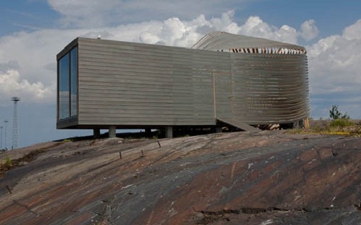
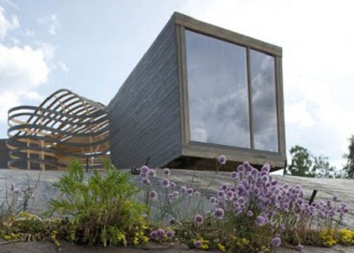
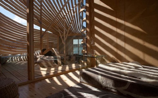
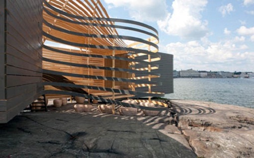
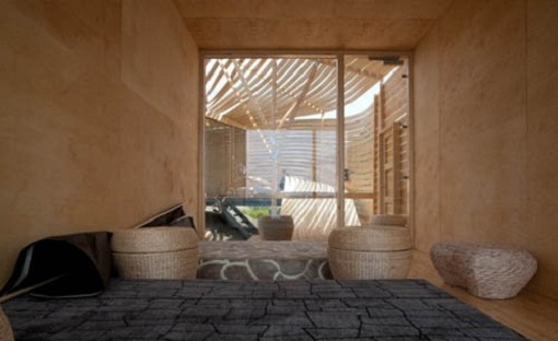
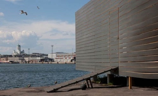
Architectural design in this article is very unique, in the use of materials and in shape. About 90% of the entire building uses material from the timber, except for the window because we can not change the timber to be transparent like glass. The form was somewhat unique, in particular the use of a square shape, and in some other part using curved forms. So far, we use wood as an ornamental building, among others, to the ceiling and floor of the room. But in this design, the function is evolving toward more distant, more than just a trimmer. For this design, the wood runs the main function as a protector, because it's almost entirely made ​​of wood construction.
The architectural design of this wooden building located in the maritime heart of Helsinki, designed by Pieta-Linda Auttila. If you look closely, this design is really amazing. In some parts of the curved shape, we can imagine how the carpenters have been working hard to get the forms that are not uncommon. Embodiment of harmonious cooperation between Pieta-Linda Auttila as architects and carpenters who have worked hard, producing stunning wooden architecture building design. via
Unique Architecture Building
Modern Architecture Building
Amazing Architecture Building
Architecture Building Using Wooden Material
Exterior Architecture Building
Interior Architecture Building
Contemporary Architecture Building

Home Architecture Designs in Modern Style

Monday, July 4, 2011

Home Architecture Designs Front View
Home Architecture Designs - Front View
The history of modern home architecture designs has not been so long, began in 1945 in southern California. At that time, many residential houses were destroyed by war. So, a designer produces a new idea, about a house that uses a completely different design to the design of most of the time. This idea is even contrary to traditional designs, many dominated by the use of building materials of glass and steel. This design is made with the aim that reproduced by developers across the country. It is intended to address the problems of post war housing. Modern design can be identified to offer open-concept interior floors, with walls less. The use of exterior building materials is more dominated by glass and steel. Has a characteristic that is an inclined straight line and tilt, not curved, tapered, or carved.
Home Architecture Designs Living Room
Home Architecture Designs - Living Room
Home Architecture Designs Bathroom
Home Architecture Designs - Bathroom
Home Architecture Designs Bedroom
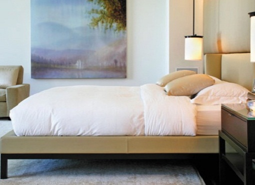
Home Architecture Designs - Bedroom

Collection of Modern Architecture Houses

Sunday, July 3, 2011

Collection of Modern Architecture Houses - The Beachfront Mirage Estate
  

Temples and Piano Hymns for Sunday 7/3/2011

Saturday, July 2, 2011

I saw this video a few days ago and just sobbed at the music and the beautiful temples of The Church of Jesus Christ of Latter Day Saints. I know the reasons for the temples. If there is one near you, please try and visit it. They are truly beautiful, magnificent sacred buildings.


~*~
 

Popular Posts